Project Overview
The Council for Transparency of Chile (CPLT) commissioned a comprehensive redesign of their "Portal Transparency 2.0" platform. This critical digital service enables citizens to access public information from government entities including ministries, municipalities, and political parties. Our team was tasked with improving the user experience through usability diagnosis, interface redesign, and HTML implementation to create an intuitive, accessible platform that would facilitate transparency and public oversight.
Challenges
Through initial research and stakeholder meetings, we identified several critical challenges:
- Complex Information Architecture: The existing portal structure made it difficult for users to find specific information across different government entities
- Inconsistent User Experience: Different page types lacked unified interaction patterns and visual consistency
- Limited Search Functionality: The existing search system yielded poor results and lacked filtering options
- Difficult Navigation: Users struggled to understand their location within the information hierarchy
- Inadequate Responsive Design: The portal performed poorly on mobile devices
- Accessibility Issues: The portal needed improvements to meet modern accessibility standards
Process
Our approach followed a user-centered methodology divided into key phases:
Phase 1: Diagnosis and Design
We conducted:
- Stakeholder Workshop: Initial meeting with CPLT representatives to understand project objectives and requirements
- Usability Diagnosis: Analysis of the existing portal to identify improvement areas
- Information Architecture Redesign: Restructuring the portal's content organization to improve findability
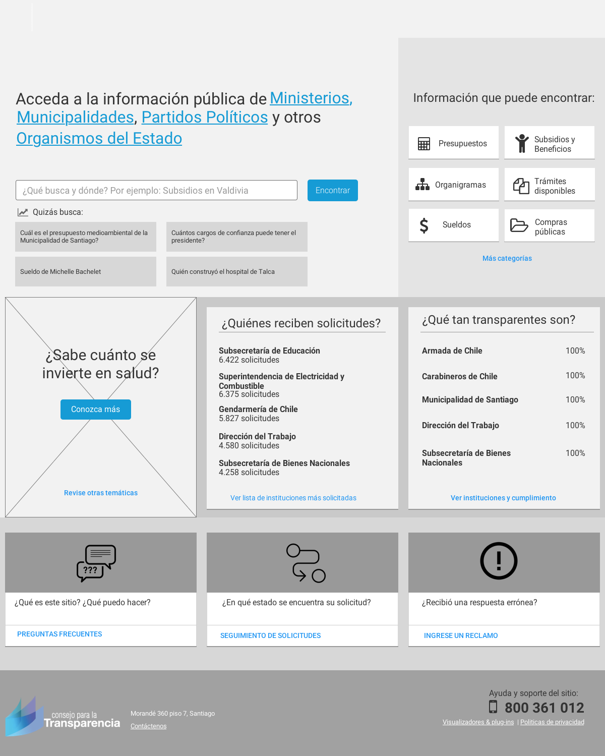
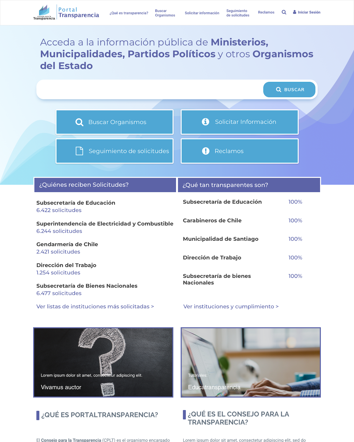
- Interface Design: Creating new designs for seven key page types:
- Homepage/Portal entry point
- Organization profile page
- Table page with filtering capabilities
- Organizations search page
- Tree-type navigation page
- Search results pages (with and without results)
- Design System Development: Creating consistent UI components and interaction patterns
- Sketch Deliverables: Complete design files in editable format for all page types
Phase 2: User Testing
With approved designs, we conducted targeted user testing:
- Search Functionality Testing: Focused evaluation of the newly designed search interface
- Navigation Pattern Validation: Testing the cascading navigation model based on GOV.UK patterns
- Iterative Refinements: Design adjustments based on user feedback
Phase 3: HTML/CSS Implementation
- Responsive HTML/CSS Development: Building mobile-friendly templates for all designed pages
- JavaScript Programming: Adding interactive elements and functionality
- Accessibility Implementation: Ensuring compliance with accessibility recommendations
- Cross-browser Testing: Validating performance across different browsers and devices
Key Features of the Redesign
- Enhanced Organization Search: A dedicated search tool allowing users to find specific government entities with predictive results and filters by location and organization type
- Cascading Navigation Model: Tree-type navigation interface inspired by GOV.UK that maintains context as users drill down through transparency information
- Unified Organization Profiles: Consolidated view of each organization's transparency data, contact information, and service offices
- Advanced Data Tables: Responsive tables with built-in search functionality and consistent display of information
- Improved Global Search: A redesigned search experience with faceted filtering and clearly presented results
- Dynamic Homepage: Featuring direct access to core functions and highlighting frequently requested information
- Breadcrumb Navigation: Clear indication of user location within the information hierarchy
- Responsive Design: Fully functional experience across all devices
Results
The redesigned portal delivered significant improvements:
- Enhanced Information Accessibility: Clearer pathways to transparency information through improved navigation and search
- Consistent Experience: Unified design language across all page types
- Improved Usability: Intuitive interface requiring less cognitive load from users
- Better Search Results: More relevant search outcomes with helpful filtering options
- Mobile Optimization: Full functionality on all device types
- Modern Interface: Contemporary design aligned with international transparency portals
Implementation Plan
The project was executed in three main phases:
- Diagnosis and Design: Usability analysis and creation of new page designs
- Deliverable: Sketch files with complete designs for seven page types
- User Testing: Targeted evaluation of search functionality
- Deliverable: Testing results and design refinements
- HTML Implementation: Development of responsive templates
- Deliverable: HTML/CSS/JavaScript code for all designed pages
The phased approach allowed CPLT to review and approve each stage before proceeding, ensuring alignment with organizational goals.
Lessons Learned
This project reinforced several important principles:
- Transparency as User Experience: Beyond technical compliance, true transparency requires intuitive information access
- Pattern Recognition: Leveraging established patterns (like GOV.UK's cascading navigation) creates familiar experiences for users
- Search-First Behavior: Recognizing that many users prefer searching over browsing hierarchies
- Progressive Enhancement: Building a solid foundation that works for all users, then enhancing for modern browsers
- Responsive Approach: Designing for all devices from the beginning rather than as an afterthought
The CPLT Portal Transparency 2.0 redesign represents a significant advancement in how government transparency information is presented to citizens, setting new standards for usability in public sector platforms across Chile.